Facebook’s latest update popped up on one of our profiles this morning. Here’s a preview, just in case you haven’t seen it yet. Trust us, it’s very different. It’s too new to give a real opinion yet but, so far, we’re shocked at the different look. This ain’t your old Facebook, that’s for sure.
Here’s what greeted us this morning:
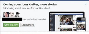
We clicked on the green ‘Give It a Try’ button and this menu came next:
When everything is loaded, click the ‘Take a Look’ button:
First off, Facebook runs you through some explanations of the new GUI (graphic user interface…in other words, what’s in your face now!):
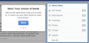
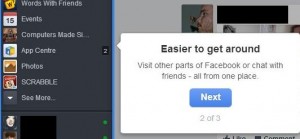
You decide what is on your main page. Next up is the ‘Easier to get around’ menu. Nothing new here, even though they say it’s different. The look is different, not the clickables:
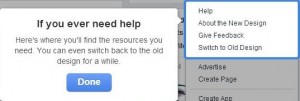
If you need help, Facebook Help is always there. You can even switch back to the old interface. Notice that it says ‘For a while’. Seems like you have to adopt the new look even if you don’t like it. That’s Facebook for you.
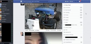
Here’s the total new look, your regular newsfeed; bigger photos, less clutter but a definite feeling of claustrophobia, at least for us. No open spaces, everything is full of stuff. Makes for a very busy look, don’t you think?
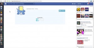
We think it’s very cramped, very tight. The space for ads is much larger. We noticed that right away. Facebook didn’t do this for you, they did it for their ads. Here’s what an app page looks like:
Up on the right, there is the feed menu. Facebook reminds you that you can choose the types of feeds that show up on your main page:
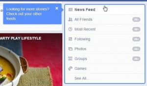
That’s the tour so far. We’ve covered the main page differences here but, as time goes by, we’ll share any other differences that we find. Navigation is very different. If you want to get to your Timeline, you have to click on your own profile photo. Once you’re there, you’ll see bigger ads on the right and lots of open space. We wish the open space was on the newsfeed page instead of the huge photos and clutter. You’ll see a very busy look on your new Facebook, that’s for sure. Share your thoughts with us, let us know what you think.
Thanks for reading!

Where can you download this update or is it just automatic?
Everything is automatic. We only have the new look on one account and it just appeared one day. We’re not sure if it’s geographical or based on user activity. It might be because our Facebook page is linked to the profile that has the new look. We don’t know what triggers these things because the new-ish search gimmick appeared on a completely different account but it’s now integrated into the new look. We will post a link in a few minutes that might speed things up. It’s supposed to put you on a waiting list to experience the new look. Here’s the link, just for you: Facebook Waiting List for the New Look
Thanks for commenting!