Tag Archives: New Facebook Look

Navigating the New Facebook

We got wind of the latest Facebook update earlier this week. After living with it since then, we’re still semi-semi on it. It has some good features but it still seems very busy and cramped. Today’s post will deal with the layout and navigation plus one cool new feature that we’ve discovered.

1. How do you feel? This is silly but Facebook has added a set of smilies to your status updates. Here’s where you start:
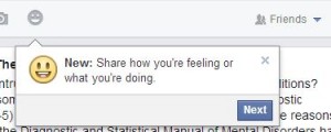
Photo of How do you feel menu.
Now you can share your REAL feelings! Or simply tell everyone that you’re having a coffee.

Facebook seems pretty happy about their new gimmick, don’t they? Once you get back to your normal status window, clicking on the grey smiley will bring up this:
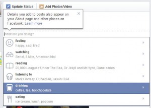
Photo of mood selection menu.
A wealth of selections to fine tune your mood.


Once you  wend your way through these selections and make a choice, then post your status update, this is what your friends see. Clicking on the mood or action you’ve chosen brings up the chance to Like whatever it is that you’re doing, could be drinking coffee or listening to the Beatles.
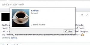
Photo of Happy menu 3
How many of your friends like coffee? Facebook will tell you.


As you can see, this is just another way for Facebook to get to know you and your friends. Why do they care? Simply because they want to tune their ads to your well-defined demographic. Every time you click like or add a friend or do just about anything on Facebook, your Facebook profile is tuned to a higher level. Think about it. Facebook probably knows you better than your SO! (Significant Other)

2. Post from anywhere: A big part of the new Facebook design isn’t a gimmick, thank goodness. The best part of the change is the ability to post from anywhere on Facebook. Previously, you had to go back to your main Facebook page, your homepage in other words,  or your Timeline to post a status update or add a photo or video. Now, you can post from anywhere in Facebook, even if you’re on another person’s page.

Photo of Post Menu
This is what you see when you are on your own Facebook page.


See the new button? It’s the word Post up on the top right. Let’s say you are on another Facebook page, a radio station’s page for example. Here’s what happens:
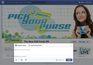
Photo of Post Menu
The new status or post menu pop-out.


It doesn’t matter where you are on Facebook, you don’t have to go home to post. Click the word Post and say or share what you will, no problem. We think this is the best part of the new Facebook design, don’t you?

If you have comments or questions on anything related to just about anything, ask us. We’re always looking for new challenges. Better yet, why not Like us on Facebook? Here’s the link:

Computers Made Simple on Facebook

Thanks for reading!


The Latest Facebook Update – as of May 15, 2013

Facebook’s latest update popped up on one of our profiles this morning. Here’s a preview, just in case you haven’t seen it yet. Trust us, it’s very different. It’s too new to give a real opinion yet but, so far, we’re shocked at the different look. This ain’t your old Facebook, that’s for sure.

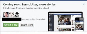
Here’s what greeted us this morning:

Photo of New Facebook 1
Coming soon? Looks like it’s already here.

We clicked on the green ‘Give It a Try’ button and this menu came next:

Photo of New Facebook 2
The process takes a while to load. Be patient.


When everything is loaded, click the ‘Take a Look’ button:

Photo of New Facebook 3
You’d better be sitting down. This is a very different Facebook.


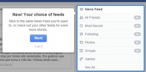
First off, Facebook runs you through some explanations of the new GUI (graphic user interface…in other words, what’s in your face now!):


Photo of New Facebook 4
The new Facebook allows you to choose everything or just some feeds. Maybe this is the ‘less clutter’ part.


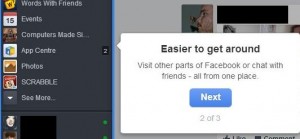
You decide what is on your main page. Next up is the ‘Easier to get around’ menu. Nothing new here, even though they say it’s different. The look is different, not the clickables:

Photo of New Facebook 5
Everything was on the left side anyway, right? Is this different?


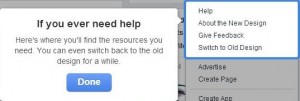
If you need help, Facebook Help is always there. You can even switch back to the old interface. Notice that it says ‘For a while’. Seems like you have to adopt the new look even if you don’t like it. That’s Facebook for you.

Photo of New Facebook 6
For a while, huh? How long before the old is gone forever?


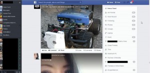
Here’s the total new look, your regular newsfeed; bigger photos, less clutter but a definite feeling of claustrophobia, at least for us. No open spaces, everything is full of stuff. Makes for a very busy look, don’t you think?

Photo of New Facebook 7
When you see your own page, you’ll get a better idea if you like this or not.


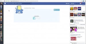
We think it’s very cramped, very tight. The space for ads is much larger. We noticed that right away. Facebook didn’t do this for you, they did it for their ads. Here’s what an app page looks like:

Photo of New Facebook 8
Less room for games but more room for ads.


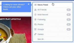
Up on the right, there is the feed menu. Facebook reminds you that you can choose the types of feeds that show up on your main page:

Photo of New Facebook 9
Everything or just one feed. You decide.


That’s the tour so far. We’ve covered the main page differences here but, as time goes by, we’ll share any other differences that we find. Navigation is very different. If you want to get to your Timeline, you have to click on your own profile photo.  Once you’re there, you’ll see bigger ads on the right and lots of open space. We wish the open space was on the newsfeed page instead of the huge photos and clutter.  You’ll see a very busy look on your new Facebook, that’s for sure. Share your thoughts with us, let us know what you think.

Thanks for reading!