We knew it was coming, thanks to this:

Once again, Facebook has changed its look. This time the change affects both your timeline and your home page. Your timeline is your own page, in case you didn’t know, while the home page is where you see what kinds of things your friends have been up to. Here’s a shot of the new timeline:
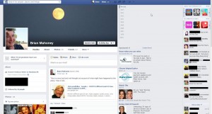
The center of the page looks much the same but the right side has the news ticker on the top, below the games and apps, with chat below. You can remove the games tab, thank goodness:
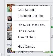
The old news ticker had only one item down on the bottom left. Your home page looks like this:
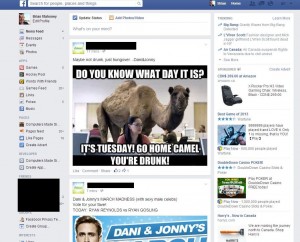
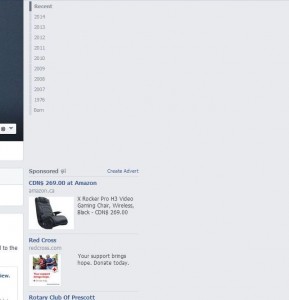
When you turn off the chat and hide the sidebar, things get pretty stark:
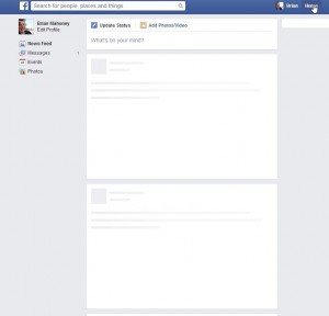
There’s also an interesting look while your home page is loading. These look like postal envelopes, don’t they?
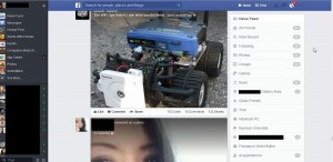
Only one of our accounts has the new look but, unless you are very observant, you probably won’t notice much difference. To be honest, we think it’s a step backwards. The black sidebar on the left looked OK, to us anyway. It was new, distinctive but maybe needed some work to show more of the ticker and less of the games, etc. Remember it?
What do you think? There’s not much we can do about any changes that come our way and not everyone has the new look yet anyway. We’re kind of non-committal about it all, basically because there’s no way to change the look yourself. Until that happens, we will just observe and share our thoughts with you.
Thanks for reading. As always, comments, questions and suggestions are welcomed. Fill in the form below or, better yet, ‘Like’ us on Facebook. Here is the link:Computers Made Simple on Facebook.
________________________________
Here’s a link that might help us if you are interested in hosting your own blog with Fatcow Hosting. We’ve signed up to become an affiliate and we make a bit of money if you sign up for hosting via this link: FatCow Hosting Thanks!
