Since our most popular posts deal with Facebook and WeChat, we decided to add another social networking site to the mix. Sure, there are many other networking sites but we like to offer complete and comprehensive advice, not a mish-mash of useless information. This post is a first look at Google +. even though we’ve had an account for a couple of years. Why? Because we never used it!
When Google + started out in 2011, it seemed to be on the verge of something great, a real contender to Facebook. For most Facebook users, however, it didn’t feel quite right. The interface was too different. Well, that was then and this is now. Facebook has changed its look so many times that we’ve pretty much forgotten what it looked like back in the beginning. To us, and this is just our opinion, Facebook is now dark and dreary. Google + on the other hand is as bright and shiny as a new nickel. (We don’t have pennies any more up here in Canada.)
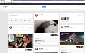
Here’s a snapshot of our Google + home page:

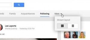
Compared to Facebook’s confusion, this page looks pretty clean and neat to us. Additionally, there are two different layouts. Here’s how you find them. Look for the word More up on top:

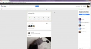
The left layout is the one you see above. The right one is like this:

The layout at the top looks good to us on our widescreen monitor. Actually, it looks a lot like a Pinterest page, right? We’ve always felt that the Pinterest design simply worked. Tumblr seems too vertical but Pinterest has a nicely-busy look. Your tastes may vary from ours, of course.
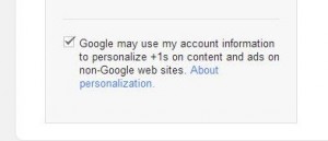
One area where Google + isn’t any different from Facebook is in how it uses your personal data. Here’s what we mean:

This is an opt-out, of course, but it seems to suggest that it’s mandatory. The wording is suggestive, as if Google might use your stuff or might not. Who uses the word ‘may’ anymore? It sounds very polite but it’s aimed at making you leave the selection as it is. Google wants you to sign in to your account and keep it open as you surf the Web. Why? Read the notice. They want to tune their ads to ‘personalize’ your experience. Sounds nice, doesn’t it? We would suggest opting out of this ‘gentle suggestion’.
Lots more to come with Google +. We haven’t forgotten about Facebook or WeChat, so don’t worry. Questions? Comments? Use the form below. We’re open to suggestions, too.
Thanks for reading!
